
Electronics & Communications
The Harry Beck Tube map began in 1931 as a draughtsman's diagram that ignored geography on purpose. Here is how horizontal, vertical and 45-degree lines made London's network easy to read.
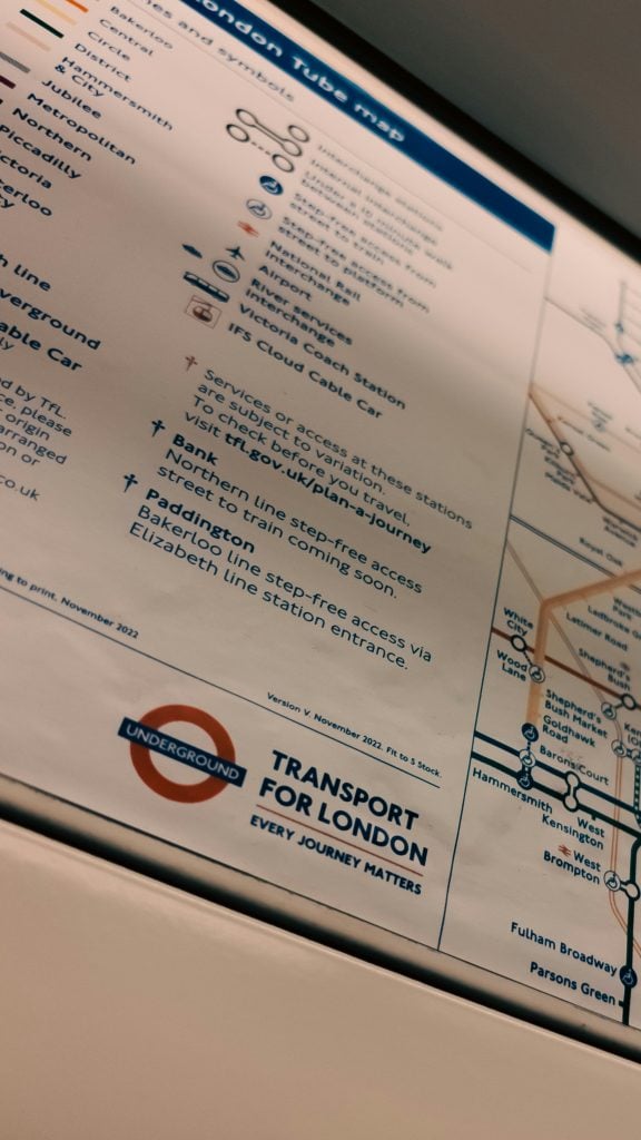
The Harry Beck Tube map is still the basis for every Underground map printed today, nearly a century after a young draughtsman created the first version in 1931.[1] Beck started with a simple idea: passengers in a tunnel do not need to know the exact street locations of stations. What matters is the order of the stops and where to change trains.
Earlier Underground maps showed London's real geography, using curving and winding lines.[2] Beck changed this by using only horizontal, vertical, and 45-degree lines. He also made the central area larger, since that is where the stations are closest together.[3]
The result is more of a diagram than a traditional map. The distances are not to scale, and that is intentional. Instead of showing the real streets above, the map models what passengers actually use: a network of lines and interchanges. Engineers often make models like this, focusing on the important details and leaving out the rest.
Harry Beck was born in Leyton in 1902.[4] He worked for the Underground as a junior draughtsman, making technical drawings for the signal engineers’ office.[5] He had this job since the mid-1920s.[6] Signalling is about making sure trains go to the right place in the right order, so it makes sense that Beck saw the network as a system of connections.
The rules for the map are similar to those used in electrical circuit diagrams: horizontal, vertical, and 45-degree lines joined by tight curves.[7] According to the London Museum, Beck was probably inspired by the circuit diagrams he drew in his earlier work.[8]
A circuit diagram does not show the exact path of each wire. Instead, it shows how things are connected. Using only a few angles makes it easier for people to follow a route and gives space to write station names clearly. Having fewer rules also makes the map easier to update, since any new line must fit the same grid as the others.
In 1931, while he was out of work, Beck created a new diagram-style design.[9] At first, the Underground's management thought it was too radical and rejected it.[10] Beck did not give up, and eventually Frank Pick, the chief executive and vice chairman of London Transport, said it was “a better map than any we have had so far”.[11]
In early 1933, the first pocket edition of the map was printed in hundreds of thousands of copies.[12][13] It was an instant success.[14] Beck is believed to have been paid only five guineas for his original design, showing that a good idea does not need a big budget.[15]
Beck was the main designer of the Underground map from 1933 to 1959.[16] In 1933, he made two more pocket maps with small changes. In 1955, he added a grid and an alphabetical list of stations on the back.[17] In 2013, English Heritage put up a blue plaque at 14 Wesley Road in Leyton, where he was born.[18]
Today, the Underground map includes a credit line saying it is based on the original design created by Harry Beck in 1931. This shows an important lesson in redesign: keep the idea that works and improve the details around it.
Every model leaves something out, and Beck's choice is easy to see. Two stations that look close together on the map might be far apart above ground, and two that look far apart might be close together. For passengers underground, this is a fair trade, because the map answers the real questions: which line to take, which direction, and where to change.
Being able to notice what a model leaves out is a helpful skill for engineers. A good engineer always asks what a drawing, graph, or simulation is meant to show, and what it is not meant to show.
Engineering is not just about building things. It is also about making complex systems easy for everyone to use. Beck's diagram is a good example of information design, where the engineer chooses what to show, what to simplify, and what to leave out.
This way of thinking appears in other Born to Engineer stories too. Karen Spärck Jones figured out how to make large amounts of text easy to search. The Thames Tideway Tunnel shows how much of London's infrastructure is hidden under the streets that Beck's map leaves out. In 2023, Transport for London and the Royal Academy of Engineering even made a tribute using the map, called TfL's Engineering Icons Tube Map.
Curriculum links: Maths (KS3 and KS4: angles, scale, and proportion), Geography (KS3 and KS4: map skills and urban environments), and Design and Technology (KS3 and KS4: designing for users and improving a design through iteration).
Classroom connections and activities:
Engineering discipline: transport and systems engineering, with links to civil engineering through the network the map describes. Teachers looking for more ready-made activities can browse the STEM classroom toolkits.
How Harry Beck revolutionised the Tube map
Today, every Tube map is printed and published with the words: 'This diagram is an evolution of the original design conceived in 1931 by Harry Beck.'
Checked 17 November 2026
A brief history of the pocket Underground map
Gone are all the curvy and wiggly geographic lines in favour of right angles and 45-degree angles
Checked 17 November 2026
Transforming the Tube map: Harry Beck’s iconic design
He limited his design to horizontal, vertical and 45-degree lines, magnifying the central area
Checked 17 November 2026
Harry Beck, London Underground Map Designer
Beck was born in Leyton, the son of Joshua and Eleanor Beck
Checked 17 November 2026
How Harry Beck revolutionised the Tube map
He took a job as a junior draughtsman, creating technical drawings for the signal engineers' office.
Checked 17 November 2026
A brief history of the pocket Underground map
Henry C Beck, now better-known as Harry, had worked as a draughtsman for the Underground since 1924
Checked 17 November 2026
How Harry Beck revolutionised the Tube map
He stuck to horizontal, vertical and 45-degree lines joined together with tight curves, as you'd find on electrical circuit diagrams.
Checked 17 November 2026
How Harry Beck revolutionised the Tube map
This was probably inspired by the electrical circuit diagrams he designed in his old job.
Checked 17 November 2026
Transforming the Tube map: Harry Beck’s iconic design
During a spell out of work in 1931, he worked on a new diagrammatic design
Checked 17 November 2026
How Harry Beck revolutionised the Tube map
London Underground rejected his design at first, considering it too 'radical'.
Checked 17 November 2026
How Harry Beck revolutionised the Tube map
Frank Pick, chief executive and vice chairman of London Transport, said Beck's design was 'a better map than any we have had so far'.
Checked 17 November 2026
A brief history of the pocket Underground map
750,000 copies of the first edition were printed, enough to last through to the summer
Checked 17 November 2026
Harry Beck, London Underground Map Designer
Some 850,000 pocket-sized copies of the 'diagram' were printed in the first two months of 1933
Checked 17 November 2026
Transforming the Tube map: Harry Beck’s iconic design
The map was an instant success
Checked 17 November 2026
Harry Beck, London Underground Map Designer
It is thought he was only paid five guineas (£5.25) for the original design.
Checked 17 November 2026
Transforming the Tube map: Harry Beck’s iconic design
Beck remained the principal designer of the Underground map between 1933 and 1959
Checked 17 November 2026
A brief history of the pocket Underground map
he added the grid, and an alphabetical list of stations on the reverse, in 1955
Checked 17 November 2026
Harry Beck, London Underground Map Designer
Plaque erected in 2013 by English Heritage at 14 Wesley Road, Leyton, London, E10 6JF
Checked 17 November 2026
Electronics & Communications

Automotive & Transport

Automotive & Transport

Automotive & Transport